ICEINSPACE

|
How to Create a Colour Saturated Moon Photo
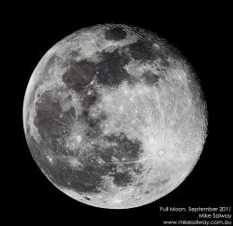
Submitted: Friday, 16th September 2011 by Mike Salway
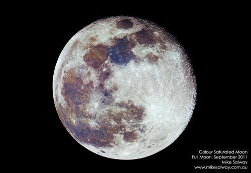
IntroductionWhy does the picture of the Moon above have those funky colours? You can't see them with your eyes, or through the telescope like that, right? Actually the colours are real - they've just been artificially boosted; amplified during processing. The colours themselves represent the various types of iron and mineral deposits on the Moon. The blue hues reveal titanium rich areas while orange and purple colors show regions relatively poor in titanium and iron. In this article, I'm going to show you how to process your lunar images to bring out those colours. I'll talk a little about the equipment and capture, but most of the article will focus on the image processing. Equipment and CaptureFor my images, I used a standard Saxon ED80 with a modded Canon 40D DSLR. You can use almost anything though - the telescope can be your newtonian, to your SCT or refractor or even a long telephoto lens. Your capture device can be a DSLR, dedicated astro camera or webcam. However there are a couple of points to consider. Focal LengthYour telescope, any extensions/barlows and the camera will dictate the focal length and therefore the image scale of the Moon when captured on the device. With a standard DSLR, a focal length of around 1000mm will fit the Full Moon in the Field of View (FOV). Any longer focal length, and you won't fit the whole Moon on the chip. You'll need to capture the parts of the Moon separately and do a mosaic to create a Full Moon image. If your focal length is too short (500mm and under), the Moon will be quite small on the DSLR chip - so when you crop the image around the Moon, you won't get the same sharpness and detail at full resolution. If you're using a webcam, the chip is much smaller and the resolution is much smaller too. It will depend on the focal length of your telescope, but you might end up with a much more "zoomed in" view and capture only a portion of the Moon. If you're using a Newtonian, your DSLR may not come to focus at prime focus unless you move the mirror up the tube. You'll have to experiment yourself - this article isn't focusing on the capture part of the process. My Saxon ED80 only has a 600mm focal length, so I used part of a 2x barlow and an extension tube (necessary to bring it to focus) to reach around 1000mm. The Moon just fits in the field of view of my 40D, but it depends whether the Moon is at apogee or perigee. I capture a mosaic anyway - see below for more. Capture Device (Camera)Any camera will work, but it obviously has to be a colour camera. A monochrome camera obviously cannot capture colour :) In my opinion, a DSLR is best for this type of job. Good size colour chip, good resolution for printing later, easy to capture onto the computer via remote control. Capture MethodWith my setup, the Moon doesn't always fit in the FOV of the DSLR so I capture the Moon in 2 parts - the top half, and then the bottom half. I obviously have a large amount of overlap. I connect the DSLR to my laptop and use the standard EOS Utility Remote Shooting to remote control my camera.
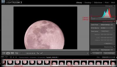
For my images, I use ISO250 and 1/60s exposure and the histogram was comfortably in the top third towards white without blowing out any highlights. I captured 60-70 images for the top half and the same for the bottom half. Take them as quickly in succession as possible and try not to let the Moon drift too much during your sequence, or Registax might have trouble aligning. The reason for capturing so many images is so that you can stack them using Registax. This reduces noise in your images and they'll be less grainy when you push the sharpening and colour saturation. You can do it with a single image, however in most cases it just won't end up as smooth. Pre-ProcessingThe images were captured in RAW format, so I need to convert them to TIF to load into Registax. I use Lightroom for this - for no other reason than it's my pre-processing software of choice. All I do is simply export all images as TIF. You can see in the image below how I capture the top half and bottom half of the Moon. The pink tinge to the images is because the camera is a modded DSLR.
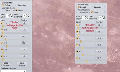
StackingLike I said above, the reason we stack multiple images together is to increase signal and reduce the noise. I use Registax for this, however you may prefer to try other DSLR image stacking programs like ImagesPlus or other. I actually had some difficulties with Registax. The latest version (v6) just doesn't work for me with these large images. I ended up using Registax 5.1 with a single alignment point. You can experiment with what works best for your images on your computer - but the end result is you want to stack the sharpest of your images, and apply some wavelets to the stacked image. I stacked the sharpest 30-35 frames, and produced 2 versions - a "harder" wavelets version which brought out more detail, and a "softer" wavelets version that I use for the very edge of the Moon. You'll see shortly why I do this. I saved each version as a TIF. Don't forget I repeat this process for both the top half and bottom half of the Moon - I haven't joined them yet.
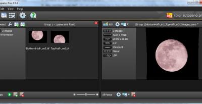
Merging / MosaicI'm now ready to join my Moon Halves into a Full Moon. I've got 4 images now:
I use AutoPano Pro to do any stitching/mosaic work. It's just simply the best program around and works exceptionally well. The normal workflow in AutoPano Pro:
It's that easy. I've never had a time when it couldn't stitch my mosaics together.
Processing in PhotoshopNow for the fun part. Everything we've done so far is just to get a sharpened Full Moon image into Photoshop so we can bring out the colour! Fixing the LimbYou should now have 2 images - a stitched "hard wavelets" version, and a stitched "soft wavelets" version. The reason I process two versions, is because when you use harder wavelets, it can be quite harsh on the edges of very contrasty areas - especially the limb of the Moon. It creates a hard white edge that can make it look overprocessed. So I copy the outer few pixels of the "soft wavelets" version, and paste them over the top of the "hard wavelets" version to make the limb look less processed. The process I use to do this is:
Switch to the "hard" image
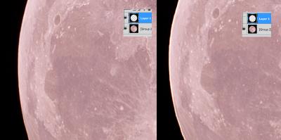
You can see the effect in the image below; the right part of the image shows the limb with the soft layer switched off. You can see how there's a hard white edge that looks pretty ugly. The left part of the image shows the soft layer switched on. It's much softer and more natural looking around the limb.
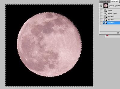
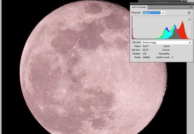
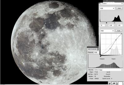
Fixing Colour BalanceYou can see from the images above that the Moon has a very pink colour cast - the reason for this is because I was using my modded Canon 40D for these images, which gives a pink tinge to all the images as its capturing more into the infrared part of the spectrum. You can see from the image below how pink it is, and how mismatched the histogram is with the colour channels all over the place. So we need to fix that.
To fix it, use Photoshop's fabulous Auto Colour correction.
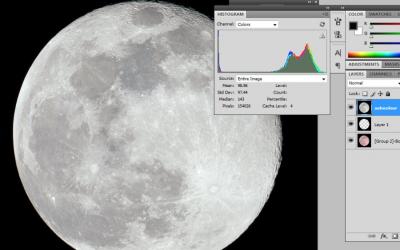
Check the result below - excellent!
Contrast Using Levels and CurvesI love a more contrasty look on the Moon, highlighting the differences between the mare and the highlands. So I use Levels and Curves to increase the contrast. There's no general "rule" for how much to apply here - it's purely personal taste and what type of image you want. Again, just keep an eye on your histogram and make sure you're not blowing out the highlights and mainly just adjusting the black points and mid levels. You can see the more contrasty image and my new histogram below, after using levels and curves adjustment layers as shown on the image.
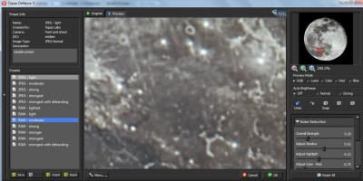
Noise ReductionCopy your adjustments into a new layer, same as before. This gives us a new base layer. Now it's time to do some noise reduction, and I use the awesome Topaz De-Noise plugin for this (the whole set of Topaz plugins are very useful). Duplicate the layer (Ctrl-J), and on the new layer, go to Topaz De-Noise. I use the "RAW Moderate" preset, but it will depend on your camera and how noisy the image is to begin with, and again you can use your personal taste and preference for how smooth you want the final result. The reason I duplicate the layer is so you can use the opacity of the layer to back off the adjustments if you think it looks a bit over-smoothed. In this case I didn't.
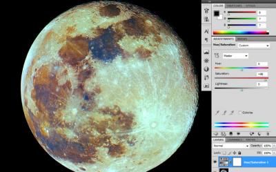
Saturated ColourNow the fun part - enhancing the colour! This is done by using a Saturation adjustment layer, and it can be as simple as a single layer and pushing the saturation hard - but it can look quite harsh and technicolour, as you can see from the image below.
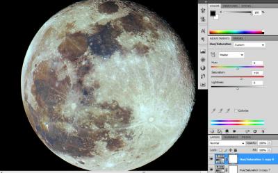
Instead, we only use minor amounts of Saturation adjustment (I use 13) and then duplicate the layers until you get the level of saturation and colour you're after. Again, it's personal taste but I usually use about 7 or 8 duplicated layers to get to where I'm generally happy. The image below shows this result.
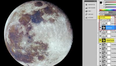
Luminosity LayerStart by merging the image so far into a new layer, by Ctrl-A, Ctrl-Shift-C, and then Ctrl-V to paste as a new layer. Then, go down and select your "after noise adjustment" layer, and duplicate it (Ctrl-J), and move it right to the top so it's at the top of your layer stack. Change the layer blending mode to "Luminosity". What this has now done, is to use the Detail from your Pre-Colourised Data, and use the Colour Data from the merged layer beneath. We can now do adjustments to the colour without affecting the sharpness, and vice versa. By using the luminance from your earlier layers, you won't get the colour noise from the saturation adjustments in your final image. Sometimes the effect is minor, but it depends on your adjustments and what other adjustments or sharpening you might do. See the screenshot for the example, hopefully it'll make more sense.
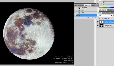
Final AdjustmentsI might sometimes do some final adjustments (personal taste) to Colour Balance or Curves, and I can do this between the merged saturation layer, and my luminosity layer, or applied to the whole image. You can see in the image above I've done a couple more adjustments to get the image how I like it. Saving for LaterI still need to do some final web or print preparation, but you'll want to save a version with all of your layers still in case you want to modify the image later. I call my file something like "moon-working.psd". Adding Text and Web PreparationThe hard work is now done. I flatten the image (Layer->Flatten Image), and save as a new filename, "moon-flat.psd". I can now do any final touches such as:
The image below you can see the flattened image with a text layer added.
Want a Less Saturated Version?Not everyone wants a highly saturated version - that's no problem. It's easy to create a less saturated version with all the same adjustments.
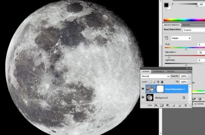
If you want it pure black and white, you can always change the image to greyscale (Image->Mode->Greyscale) instead of RGB. In the image below you can see a version that has been flattened, and a new de-saturation layer added where I mostly de-saturate the image. Again, it's personal taste.
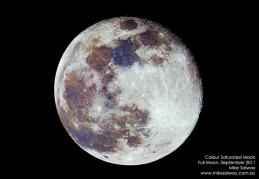
ConclusionWhat I have presented has been my workflow - there are always many ways to achieve the same or a similar result, and your mileage may vary. This tutorial should be used as a guide rather than verbatim; your image may not respond well to the same adjustments, depending on the telescope and camera used. I sincerely hope that it does inspire you to give it a go, and I hope you try and improve your skills in image capture and processing. I look forward to seeing your attempts in the IceInSpace Solar System Forum. Larger versions of my final saturated and de-saturated Moon images are posted on my blog at: Colour Full Moon, September 2011.
 |
|
|||||||||||||||||||||||||||||||||||||||||||||||||||||||||||||||||